uk
uk en
enIELTS Line Chart Model Essay
The graph below shows the quantities of goods transported in the UK between 1974 and 2002 by four different modes of transport.
Summarise the information by selecting and reporting the main features, and make comparisons where relevant.
Write at least 150 words.
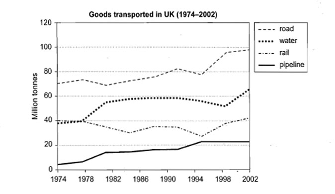
The presented line chart depicts the amount of goods, conveyed by means of four types of transport in the UK during the certain period of time (1974 – 2002).
In general, during all the period of time, among all the modes, road transport was used the most. Furthermore, three out of four types of transport showed rising trends (road, water and pipeline), while transportation goods by rail was quite inconstant.
Road transport conveyed approximately 20-30 mln tons of goods more than water transport (the second largest) did – from 70 mln t in 1974 it went gradually up with small ups and downs and reached 95 mln t in 2002. The amount of goods transported by water was steady in 1974-1978 (about 39 mln t), after that it increased significantly to 60 mln t in 1982 and reached a plateau till 1990. After a slightly drop in 1998, it started to grow again.
The amount of goods transported by rail was changeable – from 40 mln t in 1974, it increased in 1984 nd 1996 to 30 mln t, but in 2002 reached 40 mln t again.
The least quantities of goods are conveying by pipes (from 5 mln t in 1974 to 22 mln t in 2002). Pipeline reached its peak in 1995 (22 mln t), while the other types of transport went down significantly.
Overall, the period ended with gradual growth of amounts of goods carried by all the modes of transport. It is likely, that the trends will move upward, with the predominance of rod transport.
Band score: 6.5