uk
uk en
enIELTS Line Graph Model Essay
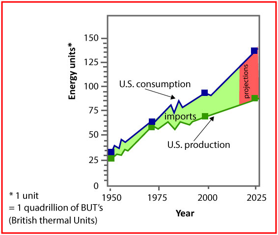
The graph below compares figures for the production and consumption of energy in the US from 1950 to 2000. It also predicts figures for 2025.
Summarize the information by selecting and reporting the main features, and make comparisons where relevant.
Sample answer
The presented line graph depicts distinctions between the amounts of produced and consumed energy in the United States from 1950 to 2000 and forecasts the trends for the nearest future (2025).
Overall, for the period from 1950 to 2000 there was observed a tendency for both of the consumption and the production to go up (from 30 e.u. to 95 e.u. and from 25 to 65 e.u. respectively), but energy requirement always exceeded its production, so during those 50 years the gap between them was enlarging, consequently energy imports were increasing.
The largest amount of produced energy falls on 2000 (65 e.u.) and the same could be said about consuming energy (95 e.u.). During the described period of time both of the patterns showed a significant growth with some fluctuations in the 50s and 90s.
By 2025 it is expected that the energy consumption will increase hugely by approximately 40 e.u. (135 e.u. totally). The production, on the other hand, will show a relatively moderate rise (85 e.u.). Thus, the gap between the production and the consumption of energy will expand in future.
Band score: 6.0
by TOWMUCH student Julia Yelovska